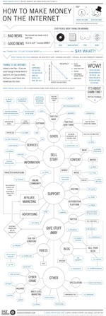
 Everybody wants to make money, right? So right off the bat, the author has come up with a clever way to draw eyeballs and potential customers to his content.
But the question, "How do I make money on the Internet?" is complex and can cover a lot of issues. I wouldn't recommend trying most of the things mentioned in the Google page I've linked to. Trying to answer that question in a blog post, or sum it up in a podcast isn't the easiest thing to do. The answers are also subjective and prone to error, since the reality is most of us aren't making tons of money off the Internet. But we'll probably be happy to give someone our opinions on how it could be done.
So, back to the infographic. (Here's a good explanation of what it is.) It's called The Ultimate Cash Flow Flowchart and I found it on the Fast Company website, where it was posted last year. I've also seen it recommended on a lot of different websites.
Take your time looking it over and following the flow. It starts off with a satirical tone, but it moves into a clever and accurate description of ways that people (and companies) are making money.
What about you? Do you have a favourite example of an effective infographic? Feel free to pass it along in the comments and give yourself a warm glow for helping with my research.
No comments:
Post a Comment